Colour in interior design is never accidental. It shapes atmosphere, influences mood, and determines how a space is experienced from the moment you step inside.
Used well, colour creates harmony, flow and intention. Used poorly, it disrupts proportion and balance.
Understanding the use of colour in interior design allows you to move beyond trends and create spaces that feel considered, calm and cohesive.
Why Colour Matters in Interior Design
Colour is both emotional and architectural.
It can:
-
- Expand or soften the perception of space
- Create intimacy or openness
- Establish focal points
- Define zones within open-plan layouts
- Connect rooms into a cohesive whole
In residential projects especially, colour must work practically as well as aesthetically. It should support daily life, natural light patterns, and the character of the property.
The Psychology of Colour in Interiors
While responses to colour are personal, certain emotional associations are widely recognised.
Red – Energy and Warmth
Used carefully, red introduces vibrancy and intensity. Deeper tones such as burgundy or oxblood feel more refined than bright primary red.

Orange – Sociability and Comfort
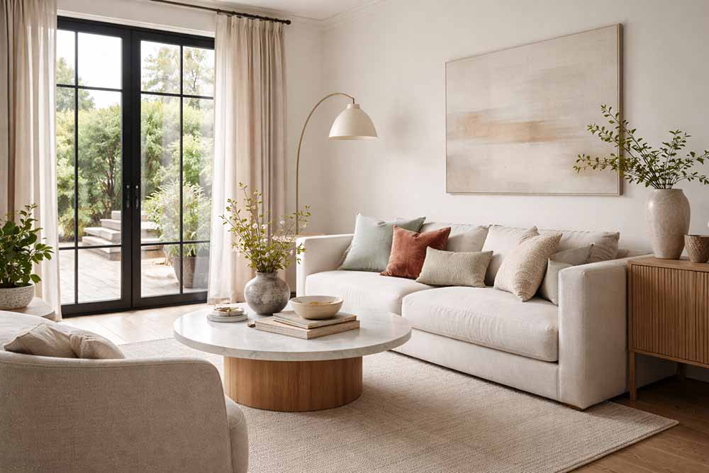
Burnt orange and terracotta tones create warmth and approachability without overwhelming a space.

Yellow – Optimism and Light
Soft ochre and buttery tones can bring warmth into darker rooms. Highly saturated yellows should be used with restraint.

Green – Balance and Calm
Green connects us to nature and promotes restfulness. Sage and olive tones work beautifully in living rooms and bedrooms.

Blue – Serenity and Clarity
Blue slows the heart rate and introduces tranquillity. Muted grey-blues are particularly suited to bedrooms and bathrooms.

Purple – Depth and Sophistication
Lighter lavender tones can feel soothing, while deeper plum adds richness when balanced with neutrals.

White – Space and Light
White enhances natural light but must be layered with texture to avoid feeling sterile.

Black – Contrast and Definition
Used sparingly, black grounds a scheme and sharpens architectural lines.
The key is never the colour alone; it is the tone, context and balance.

Creating Unity Through Colour
One of the most important principles in interior design is cohesion.
Rather than selecting colours room by room in isolation, consider developing a palette of four to five complementary tones that can be varied across the house.
For example:
-
A soft neutral base
-
A secondary grounding colour
-
One accent tone
-
A deeper anchor shade
By repeating undertones throughout different rooms, you create flow without repetition. A colour used boldly in one room may appear subtly in textiles in another.
This approach ensures personality without fragmentation.
Accent Colours and Focal Points
The eye is naturally drawn to contrast.
In any room, the boldest colour or strongest tonal difference will become the focal point — whether intentional or not.
Accent colour works best when:
-
It highlights architectural detail
-
It anchors furniture placement
-
It supports natural light direction
Introducing accent colour through cushions, artwork, or upholstery offers flexibility without long-term commitment.
Do Dark Colours Make a Room Smaller?
Not necessarily.
A dark wall can add depth rather than reduce scale — particularly when balanced with:
-
Light-toned furniture
-
Natural flooring
-
Strong natural light
-
Contrasting trims
Dark colours create intimacy. They do not automatically reduce space; they change its emotional temperature.
Monochromatic Schemes: A Timeless Approach
A monochromatic scheme uses variations of one colour in multiple shades and textures.
For example:
-
Pale blue walls
-
Mid-tone blue textiles
-
Deeper navy accessories
Layering tone instead of contrast allows the eye to move smoothly across a space, creating calm rather than interruption.
Texture becomes especially important in these schemes to prevent flatness.
Colour and Light: Why Testing Is Essential
Colour changes dramatically depending on light.
Natural daylight shifts throughout the day. Artificial lighting (warm or cool) alters undertones significantly.
Before committing to paint:
-
Test large samples
-
Observe in morning and evening light
-
Check under artificial lighting
Warm tones tend to advance visually. Cooler tones tend to recede.
The orientation of the room should always inform the final decision.
Using a Colour Wheel
A colour wheel remains one of the most practical tools in interior design.
It helps to:
-
Identify complementary colours
-
Build harmonious combinations
-
Understand warm vs cool undertones
While instinct plays a role, structured colour relationships ensure a more professional result.
Colour as Structure, Not Decoration
Colour should never be an afterthought.
It should support:
-
Architectural features
-
Furniture scale
-
Lighting strategy
-
The lifestyle of the homeowner
When approached with clarity and restraint, colour becomes one of the most powerful tools in interior design.
If you are unsure how to develop a cohesive palette for your home, a structured design process can help ensure that every decision contributes to a balanced, unified result.
If you would like guidance in developing a cohesive colour palette tailored to your home, our Residential Interior Design service provides a structured approach to planning layout, materials, lighting and colour as one considered scheme. You can learn more about our residential projects and process on the Residential Interior Design page, or get in touch via our Contact page to discuss your space and how we can support you.
Speaking of Interiors
Your interior designer in London