A home that feels calm, considered and well-designed rarely relies on standout colours alone. What truly elevates an interior is how colour moves through the space — gently guiding the eye from room to room without abrupt stops or visual confusion.
Colour flow is about connection. It ensures each room feels like part of a wider story rather than a series of isolated decisions. When done well, it brings harmony, balance and an effortless sense of cohesion to your home.
If you’ve ever walked through a house that felt “right” without knowing why, chances are colour flow played a quiet but powerful role.
Step 1: Identify the Visual Anchors in Your Home
Before thinking about paint shades or accents, step back and look at the elements that already influence how colour travels through your space.
These might include:
- Flooring that runs between rooms
- Large furniture pieces visible across sightlines
- Architectural features such as staircases, fireplaces or joinery
These elements act as visual anchors. Rather than fighting them, colour flow works best when it responds to them — echoing their tones, undertones or materials so the eye moves naturally through the home.

Designer’s perspective:
Strong anchor pieces help guide colour transitions. When these elements are respected, softer colours can shift subtly around them without breaking the overall flow.
Step 2: Establish a Consistent Undertone
One of the most overlooked aspects of colour flow is undertone. Even when colours change from room to room, consistency in warmth or coolness keeps everything feeling connected.
You might choose to work with:
- Warm undertones (creamy whites, soft taupes, earthy hues)
- Cool undertones (greys, blue-based neutrals, muted greens)
Once this undertone is established, you can move confidently between lighter and deeper shades without the home feeling disjointed.
This is often what separates a cohesive interior from one that feels unintentionally mismatched.

Designer’s Perspective:
Undertone is what allows colour to flow seamlessly from one space to the next.
In this room, a consistent cool base creates calm continuity, while shifts in depth and texture add interest without breaking cohesion.
By keeping undertones aligned, you can introduce contrast and personality without the space ever feeling visually disjointed.
Step 3: Use Depth and Balance to Guide the Eye
Rather than repeating the same colour everywhere, colour flow relies on variation with intent.
Design principles such as the 60–30–10 balance help here:
- A dominant tone grounds the space
- Secondary tones add contrast and interest
- Accents introduce personality and rhythm
When these proportions are echoed across rooms — even with different colours — the home feels visually balanced.

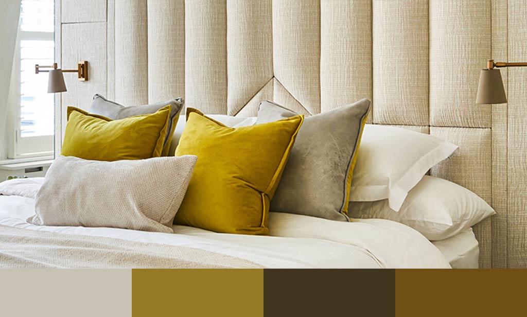
Designer’s Perspective:
This flat shows how depth and balance can vary from room to room while still feeling cohesive.
A consistent neutral base runs throughout, while shifts in depth — from soft mid-tones to deeper accents — give each space its own identity.By repeating materials, finishes and accent colours across rooms, the home feels layered and connected rather than repetitive.
Step 4: Create Gentle Transitions Between Spaces
Flow is most noticeable at thresholds — doorways, corridors, open-plan areas and staircases.
Instead of abrupt changes, aim for soft transitions, such as:
- Using a deeper or lighter variation of a colour in adjoining rooms
- Repeating accent colours in subtle ways (artwork, cushions, lighting)
- Allowing finishes or textures to bridge spaces visually
In open-plan layouts, this approach helps define zones while maintaining a sense of unity.
Step 5: Layer Accents to Reinforce Flow
Accent colours play an important role in guiding movement through a home. Rather than confining them to one room, allow them to appear — lightly — across multiple spaces.
For example:
- A deep blue introduced in a living room may reappear in artwork elsewhere
- A muted green used in a hallway might be echoed in soft furnishings nearby
This repetition doesn’t feel repetitive — it feels intentional, helping the eye travel naturally.
Step 6: Respond to Natural Light
Light has a significant impact on how colour is perceived — and therefore how it flows.
- North-facing rooms often benefit from warmer tones
- South-facing spaces can handle cooler or deeper shades
- Transitional areas may need softer, more neutral hues to avoid visual stops
Always view colours at different times of day and consider how they relate to neighbouring spaces, not just the room in isolation.

Designer’s perspective:
A colour that works beautifully in one room can feel flat or disconnected elsewhere. Observing how light shifts throughout the day ensures colour flow remains consistent and considered.
Step 7: Test Colours in Context
To truly understand how colour will flow, testing is essential.
Paint large sample areas or boards and move them between rooms. Observe how they interact with flooring, furnishings and adjacent colours. This step often reveals subtle clashes or opportunities for refinement before committing.
Common Mistakes That Disrupt Colour Flow
- Choosing colours room by room without considering transitions
- Mixing warm and cool undertones unintentionally
- Overusing strong colours in multiple spaces
- Ignoring how corridors and connecting spaces function
Colour flow doesn’t require complexity — it requires clarity and intention.
When Professional Guidance Helps
If your home feels visually disconnected despite good individual choices, a designer’s eye can help identify where flow is breaking down. Often, small adjustments in tone, balance or placement can dramatically improve cohesion.
If you’d like tailored guidance, our Online Interior Design Services can help you refine colour flow without starting from scratch.
Final Thought from Johanna
“Colour flow isn’t about limitation — it’s about rhythm.
When colours move naturally through a home, the space feels calm, intuitive and effortless to live in.”
By focusing on how colour connects rather than competes, you can create a home that feels cohesive, welcoming and beautifully resolved — from the front door to the furthest room.
About Speaking of Interiors Ltd.
We’re a small yet thriving Interior Design Studio based in Clapham. We offer a range of expert, affordable and personalised services for residential and commercial projects in South West London. Would you like to discuss your project with us? Book a complimentary initial consultation call to speak to our expert team.