The floors should be wood, tiles or carpet. The ceiling should be painted in white. Walls should be painted or wallpapered… This is the traditional interior design rules that most of us have followed when designing our homes.
However, although these are some of the most common ways to decorate interiors, they are most definitely not the only way of doing it!
If you’re feeling a little adventurous and are looking for the next unique way to decorate your home, we list a few ideas here for you. Explore how to use colour to make your interiors truly pop in a completely distinctive way that will not cost you much.
1. Painting architectural details
Pops of colour don’t need to be in your face to make an impact. Something like painting in a different colour the interior frame of your window, a door or even your staircase might be all you need to create a subtle yet impactful contrast in the room.

2. Paint your ceiling
If you have the luxury of a high ceiling, maybe you’d like to experiment with painting them in a different colour than the traditional white. Use colour to contrast your walls or even paint them the same colour. It will create a whole different feel in the room. If your ceilings are not as high but you’d still like to give this option a try, maybe think of using a lighter colour like a warm grey. This will give your space a unique look without making it feel smaller.

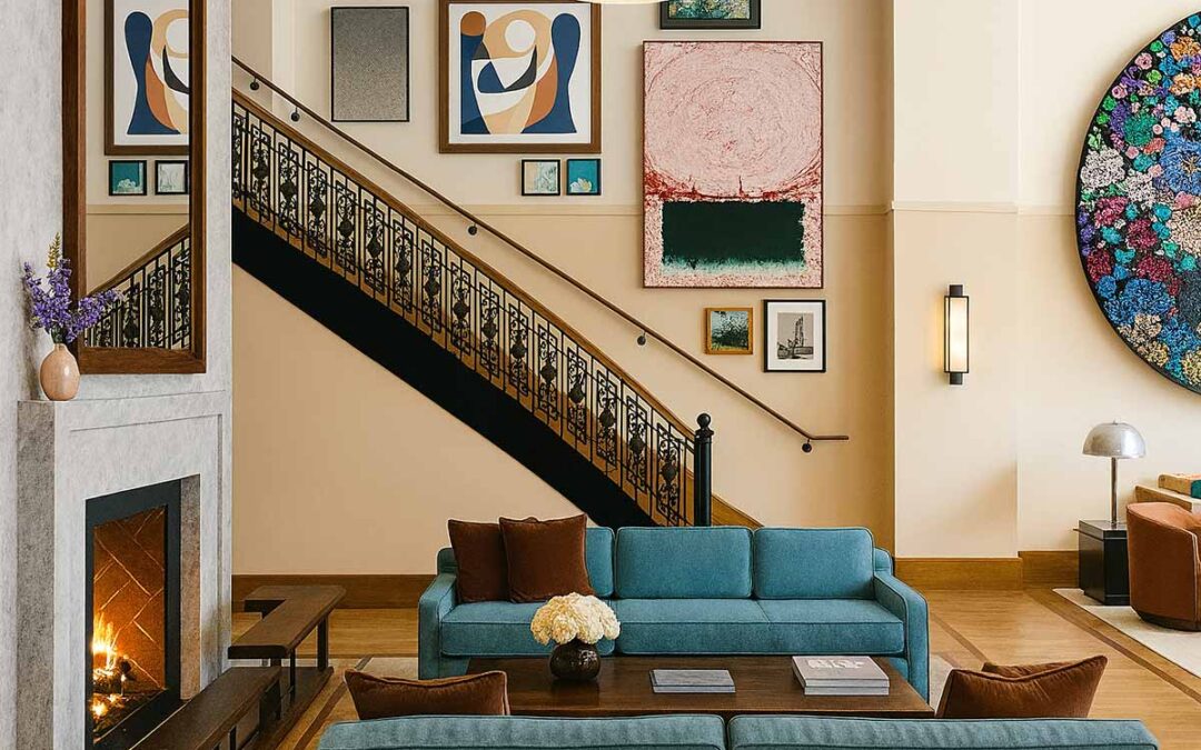
3. Paint your flooring
Why stick to only walls and ceilings when it comes to painting your home? Take it further and add colour to your floorings as well. For offices or a more commercial space, maybe even take it a little further and make a statement by painting the floor, ceilings and walls altogether for a very dramatic effect!
4. Colour Blocking: A Bold Yet Easy Way to Add Personality
Colour blocking is a creative and low-commitment way to experiment with bold shades; no need to paint the whole wall or redecorate an entire room.
Instead, choose a small section of your wall, corner, or architectural detail (like a doorframe, alcove, or behind a bookshelf) and paint it in a striking, contrasting colour. You could even carry the block across a doorway or into the ceiling for added interest.
This approach works beautifully in rental spaces or small rooms where a full feature wall might feel overwhelming.
Ideas to Try:
-
Paint a rectangular block behind a headboard or sofa
-
Use geometric shapes in soft hues for a playful effect in children’s rooms
-
Match your colour block with soft furnishings like cushions or a rug
Tip: Pair colour blocking with a neutral base palette to keep the overall look balanced.
5. Decorative wall painting
When it comes to the use of colour in interiors, treat your walls as white canvas and get inspired. Why not transform a regular door frame into a chic, Morroco-inspired paint job? The sky is the limit here.
Where to Start When Adding Colour to Your Home
If you’re not sure where to begin, start small. Look at your soft furnishings: cushions, throws, rugs, and curtains, and experiment with colours that bring you joy. Try pulling a shade from an artwork you love or a piece of fabric already in the room.
When in doubt, follow the 60-30-10 colour rule:
-
60% dominant colour (walls or flooring)
-
30% secondary colour (furniture or textiles)
-
10% accent colour (decor accessories, lamps, vases)
This is one of the easiest ways to create a harmonious, well-balanced scheme without needing a designer’s eye.
What Colours Work Well Together?
You don’t need to be a colour theory expert to create a beautiful palette. In fact, some of the most inviting interiors are built around simple, timeless combinations.
Here are a few pairings that work well in a variety of spaces:
-
Terracotta & Teal – perfect for earthy yet vibrant warmth
-
Sage Green & Warm White – soft and calming
-
Mustard Yellow & Soft Charcoal – bold yet elegant
Tip: Try using tester pots and paint swatches on different walls, and look at them in both natural daylight and evening light before committing.
Is Colour a Trend or Timeless?
While minimal, neutral interiors always have their place, colour is enjoying a well-deserved revival. But the key is not chasing trends, it’s about choosing colours that speak to you.
Think of colour as emotion:
-
A deep forest green might evoke calm and nature
-
Rich ochre tones can bring warmth and nostalgia
-
A soft powder blue might feel fresh and open
The most timeless interiors aren’t afraid of colour; they simply use it with intention. Bold doesn’t have to mean brash.
FAQ
What is the easiest way to add colour to a neutral room?
A few colourful cushions, a patterned rug, or even painted woodwork can refresh a neutral space without overhauling the entire design.
Can I mix bold colours in small rooms?
Absolutely. Bold colours can be beautiful in small rooms; just ground them with neutrals and keep furnishings minimal. Painted ceilings, doors, or skirting boards can work wonders.
Which interior colours make a space feel more luxurious?
Jewel tones like emerald, navy, and plum create a luxurious feel, especially when paired with natural textures like velvet, aged brass, or dark wood.
Helpful Links
You might also enjoy:
Would you like to an expert about your project? Book a free call and let’s get things started.
Speaking of Interiors,
Interior Designers, London